How To Sketch Unique Lettering Pieces
I have been getting some great questions recently from friends and subscribers about how I make my sketches. So this week I want to address some of those, break down my process, and share a few simple techniques I use to make better sketches.
First, what makes a sketch?
In the context of lettering, a sketch is basically just a rough version of a final drawing or idea. Often times we see the work of others in "sketch form", but for all you know, it may be the 20th tracing.
Most artists only share a tiny fraction of the work that they make. It's quite easy to forget this sometimes. So before you go comparing your sketches to the ones you see online, think about all of the versions that you are not seeing. The mistakes, the failed attempts, the smudges and eraser marks. This is where the real magic happens.
What's (hopefully) cool about this blog is that I am sharing my messy process, and unearthing some of those unpolished drawings that usually would never see the light of day.
Why is sketching so important?
The main purpose is to brain dump all the ideas I have in my head, and just play around with the letterforms on paper. I let my ideas come out naturally though my sketching.
With analog and especially digital tools, it's quite difficult to make a great design on the first try. Some people can make beautiful work right off the bat, but that is mostly found in calligraphy, not in lettering. Most of the designs I make are highly custom, and are nearly impossible to make with a one instrument in a single pass. Even when the design is more calligraphic looking, it still usually takes some ideation and tweaking to get great results.
What tools should you use?
Short answer: Use what you have.
Mainly I just use a pencil and plain paper. Pretty simple. I also like dot grid paper because it gives me a loose guideline to work from, and I like and mechanical pencils because I don't have to sharpen them. But really, any pencil will do just fine.
I like to try out new pens and markers all the time. I still have yet to find a tool that automatically makes better lettering.
Where do you start?
The blank page can be pretty intimidating. There are an infinite number of ways you can start. How do you know if you're doing it right?
Well, the beauty of sketching is that there's no wrong way to do it. The only requirement is that you put pencil to paper and keep moving your hand.
Keep it fun and loose!
There's really no need to be precious, especially with initial sketches. Details definitely matter, but I don't concern myself with the details in this early stage.
What if the sketches don't look good?
That's okay! Lettering is an iterative process. As I mentioned before, the point of sketching is to get ideas out and on paper so you can come back and refine them later. If you feel like you have done as much as you can and you still hate it, send it to another artist for their feedback. I do this all the time with my friends and they always point out something I didn't think of or see.
You shouldn't expect your first, second or third sketch to be pretty or perfect. If that's your attitude, you're bound to get frustrated. Again, this just needs to be a rough version to start with.
Ignoring that inner critic is much easier said than done, and it takes a lot of practice for it to fade into the background. Once it does though, that's when the best and most unexpected ideas will come out.
Like I said before, there's no right or wrong way to sketch. Everyone has their own way of working. That being said, I'd like to share how I typically get started, and some techniques for achieving better results. If you're still not sure how to start, I encourage you to try these ideas out and see if they help. OK, let's jump in.
Warmup Exercise
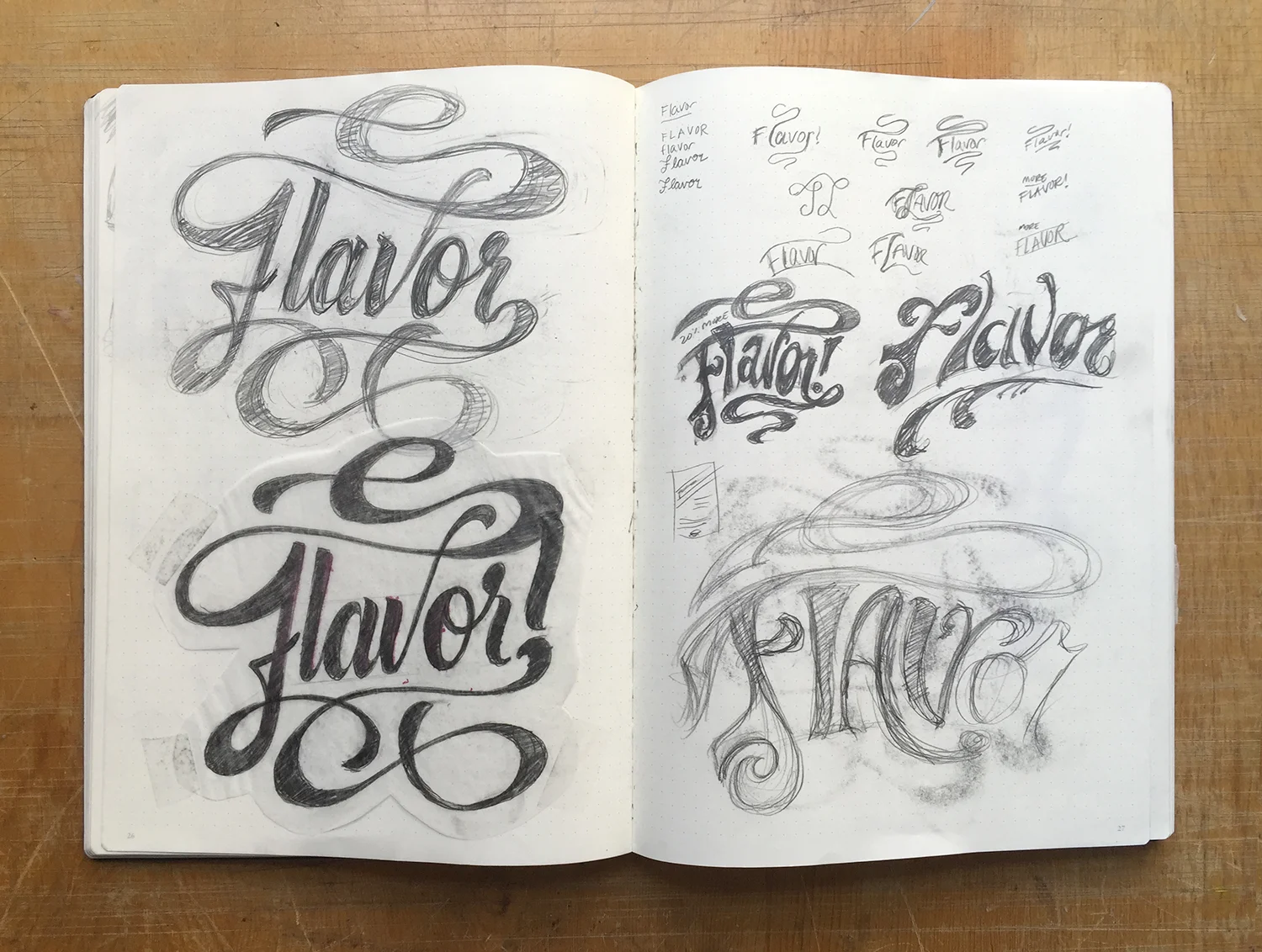
When starting a new lettering piece, I just write out the word(s) on a sheet of copy paper in a bunch of different ways. I'll try writing it in all capital letters, script, stacked, italic, maybe with an underline... you get the point. I just keep writing the words out and trying new things and eventually there's a full page of sketches, and a great starting point for where to take it.
It's very rare that I run with any of the sketches from that first page. It's mainly just to get a feel for the shapes, the length of the words, letter combinations, and potential compositions.
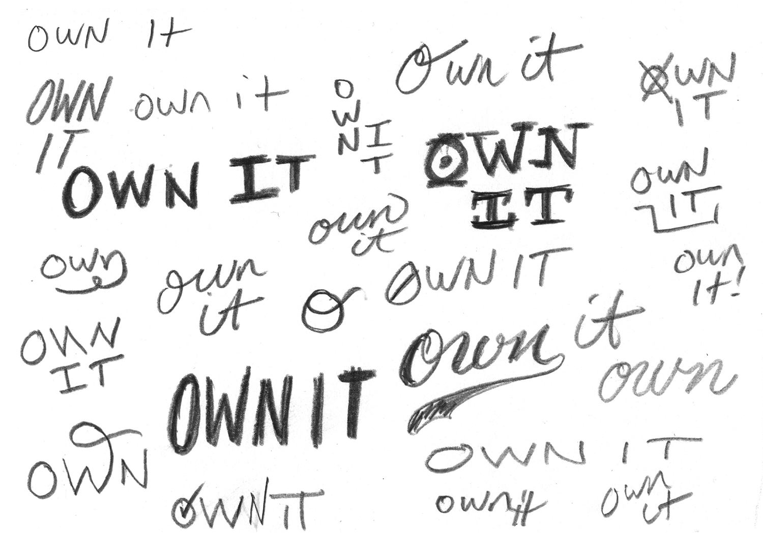
Creating Rough Compositions using "Containers"
Instead of drawing the letters right off the bat, sometimes I like to sketch arrangements of rectangles and other shapes that represent letters and words. This method enables me to visualize a composition very quickly. After you select an arrangement that tickles your fancy, you can fill in the boxes with your letters and take it from there.
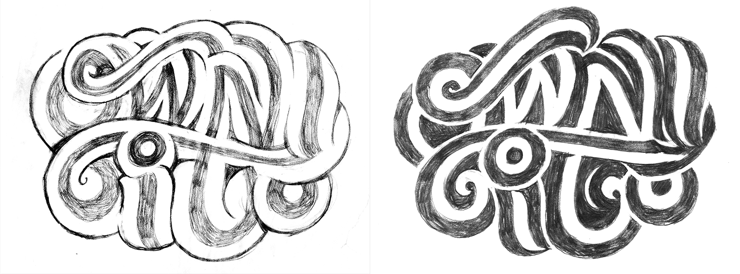
Refining the Rough Sketch
Once I have sketched out a bunch of ideas, then I take a break, and come back to clean up the most successful sketches. For this project, I came back and selected these super chunky scripts. I had been wanting to try out a similar style since I had a conversation with my friend Mark Caneso (a real master of this style), and I felt it was appropriate for the content.

This is now moving in to the refinement stage, which is slower and more analytical than the playful sketching you saw above. Even though this post is about sketching, I thought it would be good to show how it leads me to a finished piece.
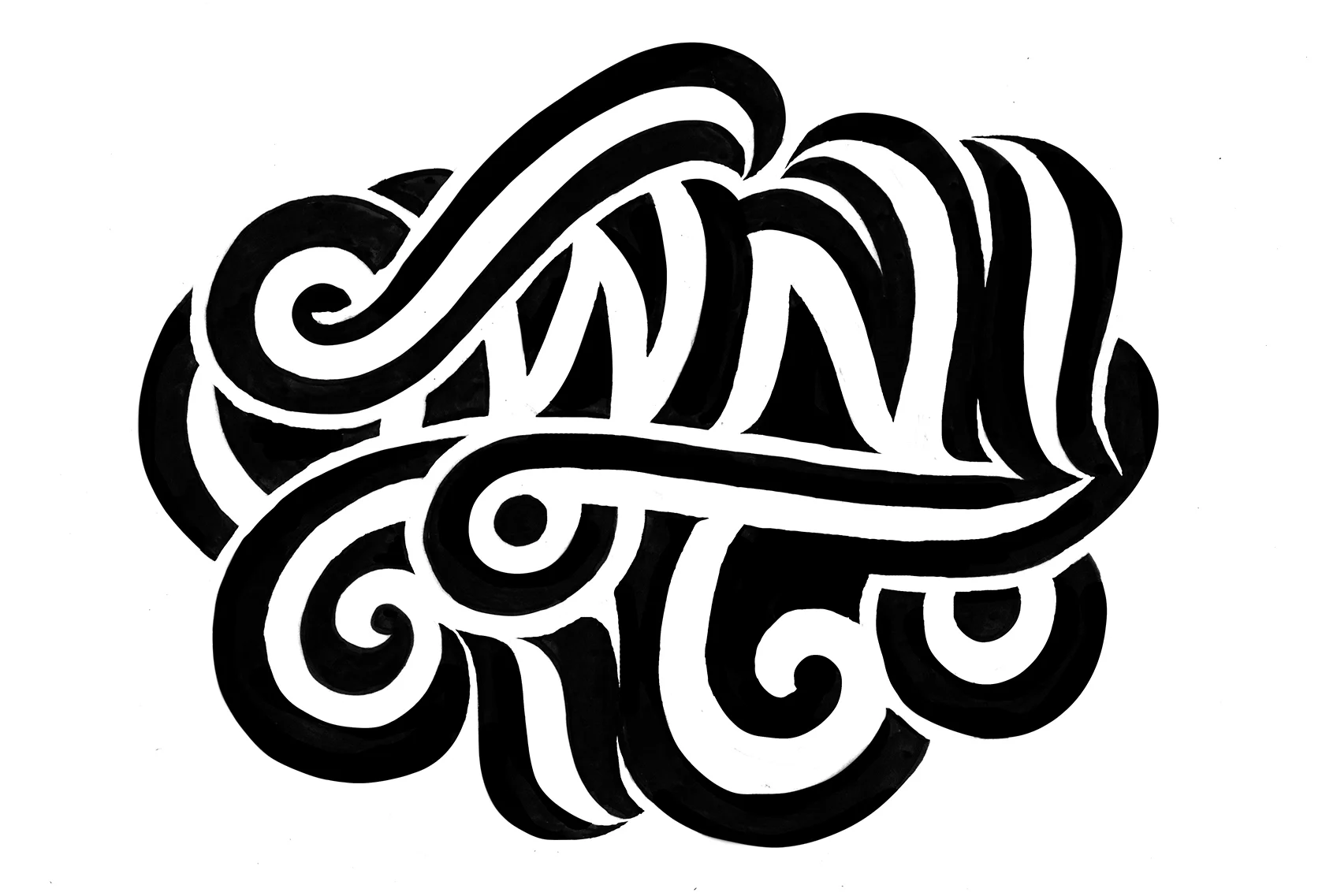
At this point, I start to take into consideration various factors such as legibility, consistency and decoration. Even though I loved the style of the refined sketch, it became almost impossible to read. So I decided to incorporate an inline inside the text (below) to improve the readability and add a little personal flavor.
Sketching the Negative Space
They say that music is really the space between the notes, rather than the notes themselves. The same is true for lettering.
The relationships and spaces between the forms are what make great lettering stand out.
Another method that I use, especially for making very bold letterforms, is building them backwards by drawing the counterforms first. It's sort of like when a sculptor chips away at a large block of marble. This is certainly a more difficult approach, but it created some interesting results.
How detailed do sketches need to be? In other words, how do you know when you're done?
This question brings me back to the difference between a sketch and a final, refined drawing. After you have worked out all of the kinks in a design, then it's time to make a tighter sketch, and eventually a final drawing.
I use a lot of the same tools for refinement as I do for sketching, so it may seem like they are the same thing. Really the difference for me is the mindset. With sketching I try to keep it loose and free, tapping into the creative part of my brain.
So, the simple answer is, I stop sketching when I feel like I have enough ideas to choose from. Usually 2 or 3 pages of rough sketches is good enough for me, but sometimes I'll get really into it and make dozens. Then it's just a matter of refining the best sketches, making a decision, and working out all of the details.
Thanks for reading! I hope this article was interesting and helpful to you. If it was, let me know! If you have any other questions, I will happily add them to this list. Just shoot me an email at eric@efdotstudio.com.

PS. Click the photo above to read the post I wrote for State Bicycle Co. covering my 8-week lettering series.