
Goals for this Design:
- Make something clever, cool and eye-catching, that entrepreneurs will be proud to wear
- Capture some of the essence/meaning of the given phrase, so the graphic feels compatible with the SPI brand

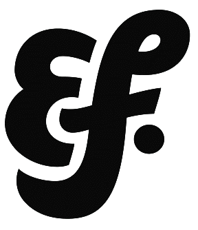
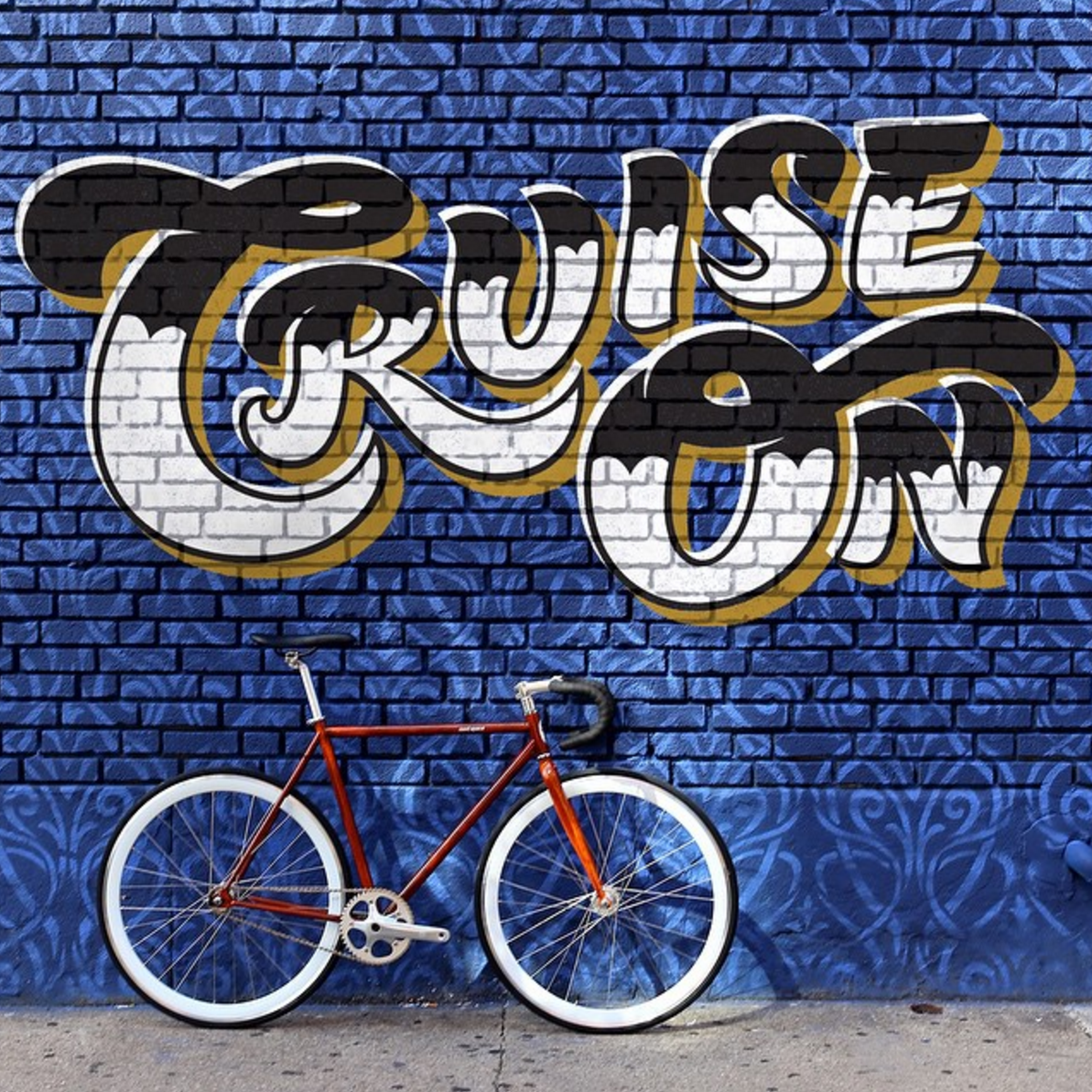
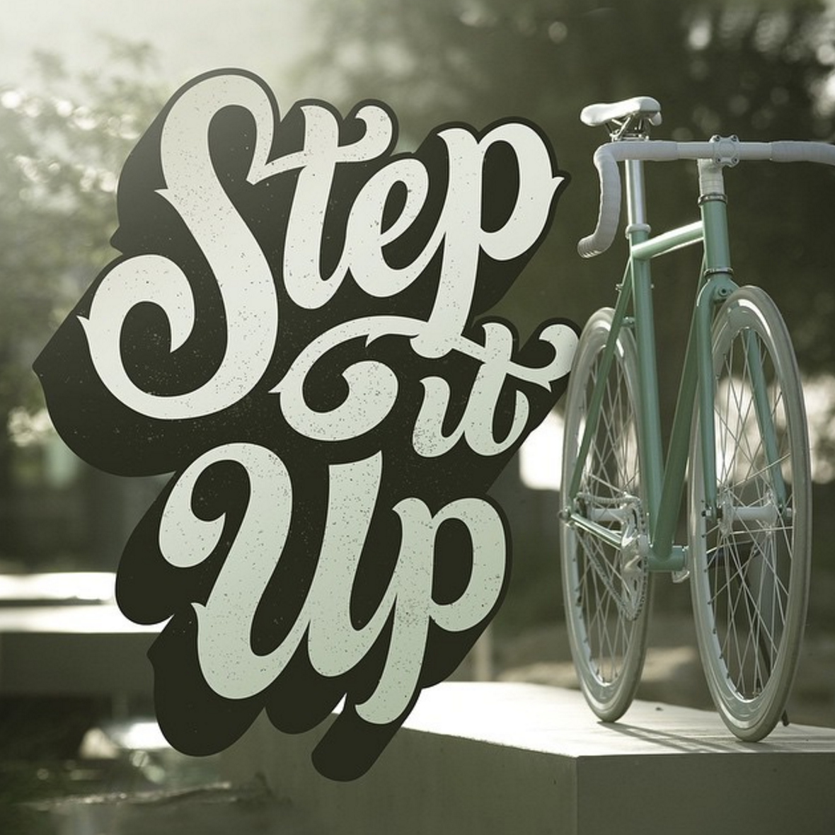
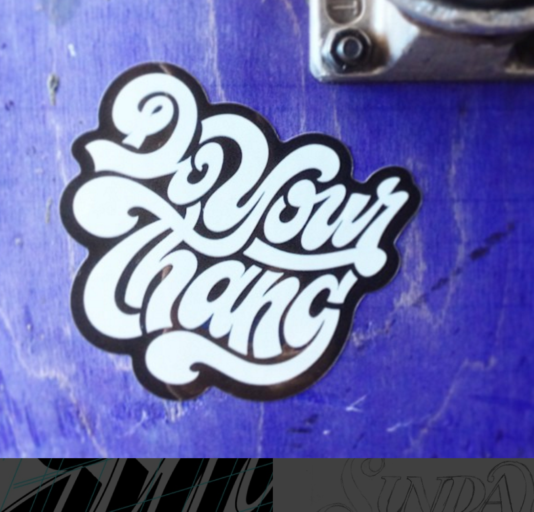
Visual Inspiration:
Each image in the provided inspiration has the following in common:
Smooth thicks & thins, boldness, tightness and "knockout coloring"
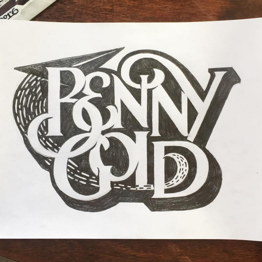
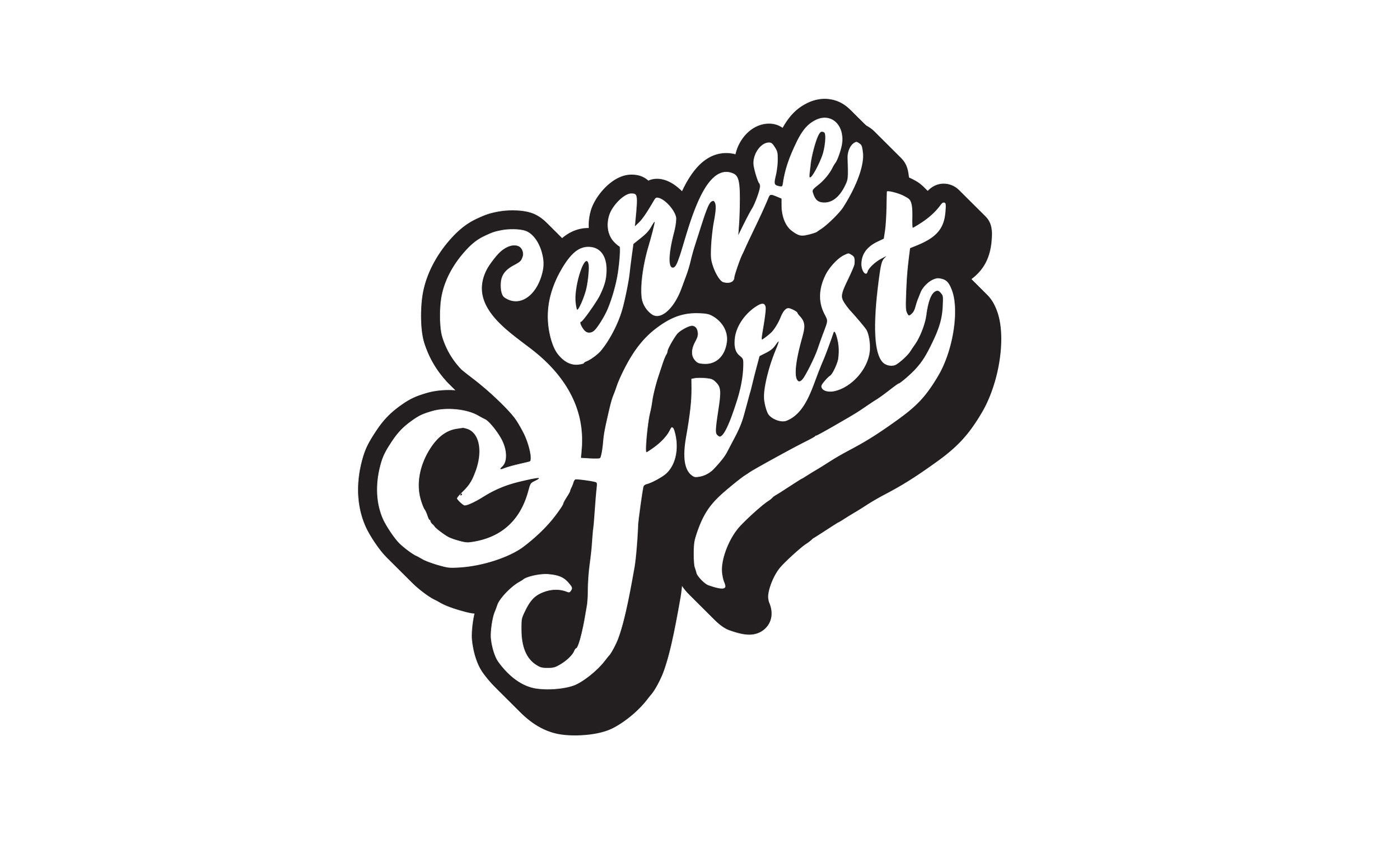
Sketch Exploration
To deliver the best possible solution, it's necessary to explore a range of compositions and styles.
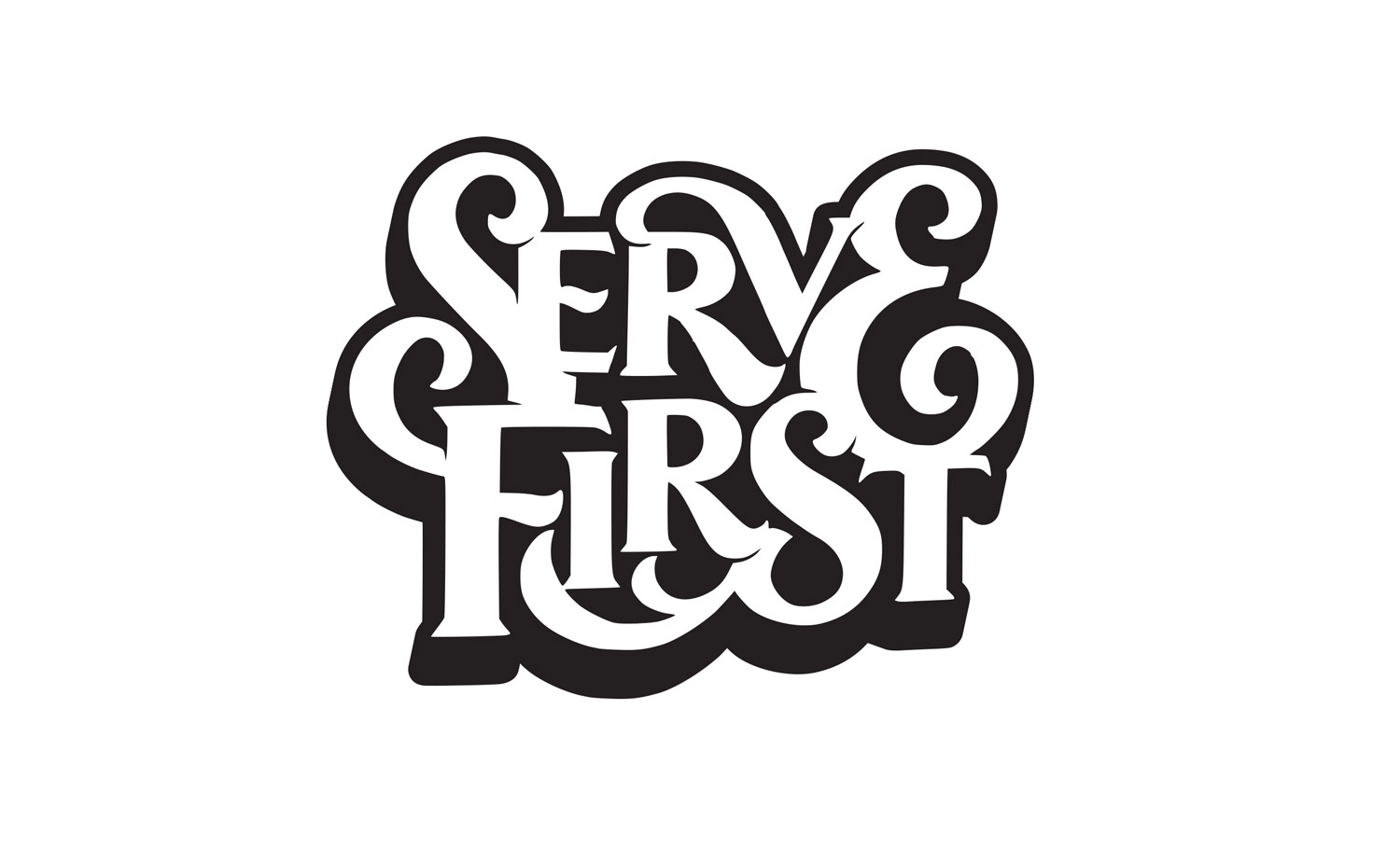
Refinement & Detailing
To make the design really pop, I started experimenting with outlines and drop shadows.
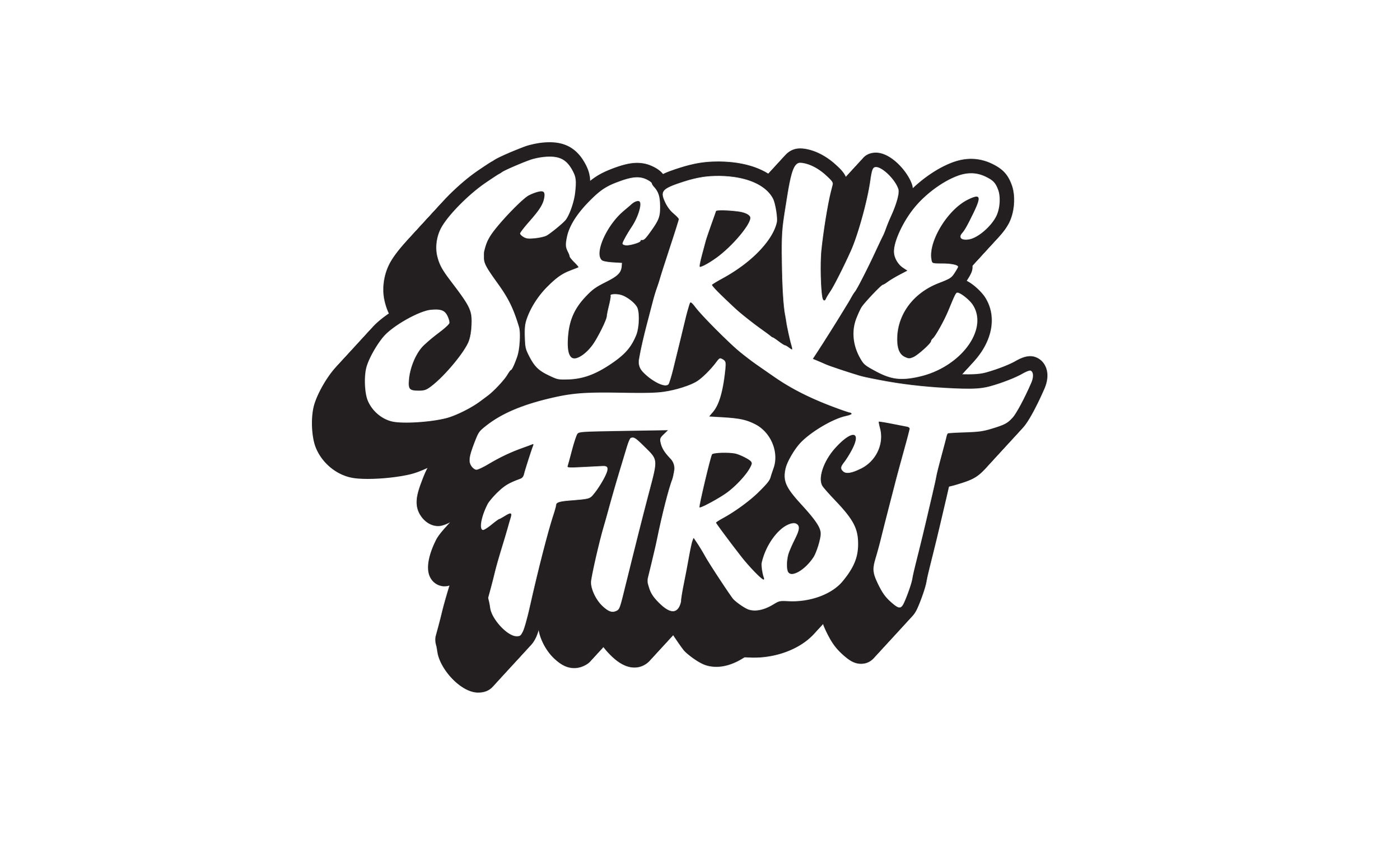

Concept 1: Cool & Casual

Concept 2: Warm & Friendly
Concept 3: Unique & Impactful

Vectorization
After choosing the best direction, I vectored the design, fixing any spacing issues and improving legibility

Final artwork
Adding the inline, outline and drop shadow make this design pop off the shirts.

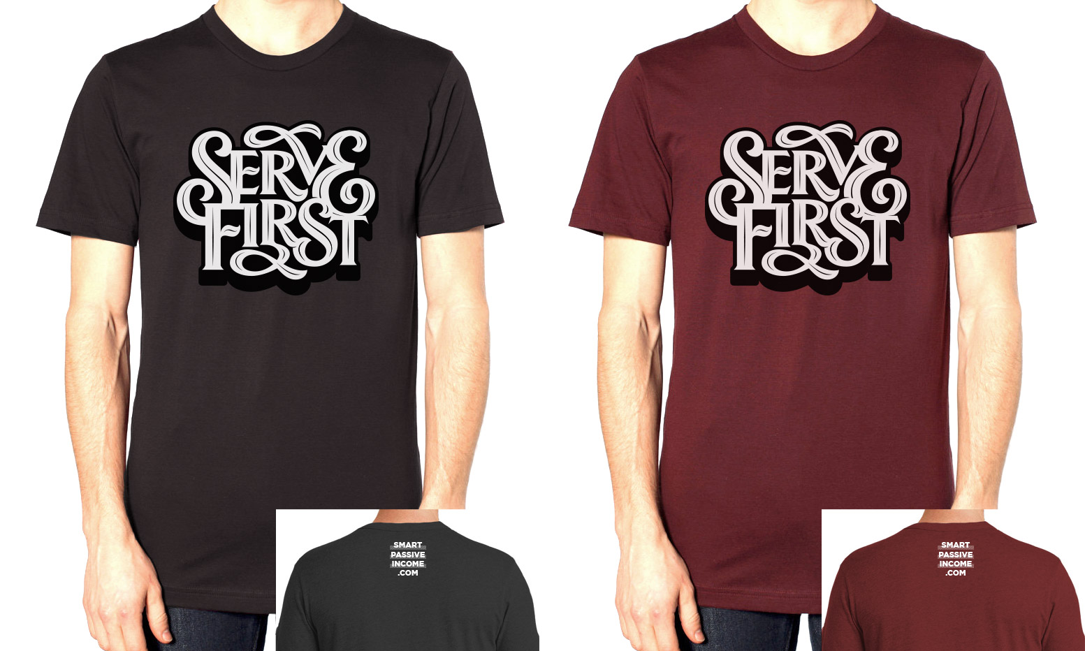
I hope the SPI community will be proud to wear these new t-shirts and continue serving their audiences!